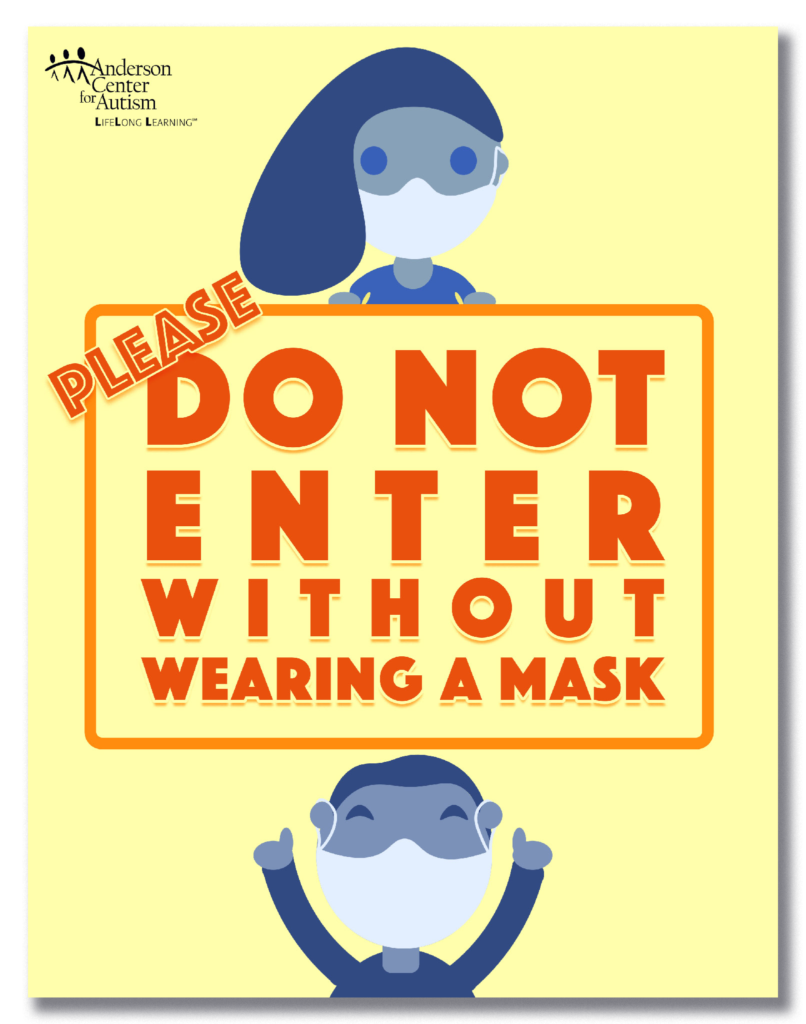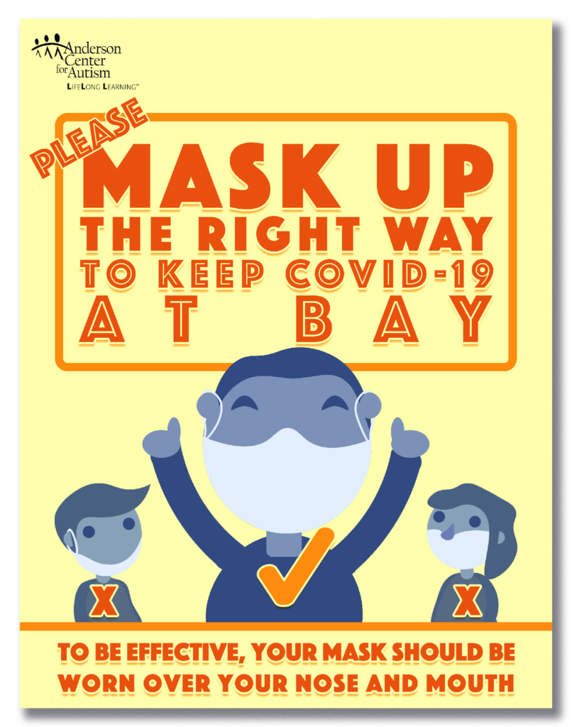
compliance with COVID-19 safety policies.
This project consisted of designing physical posters and digital displays for use on silent closed-circuit televisions. The project required a relatively quick turn around time due to the urgency of the COVID-19 pandemic.


Creating an effective entrance sign proved to be challenging.
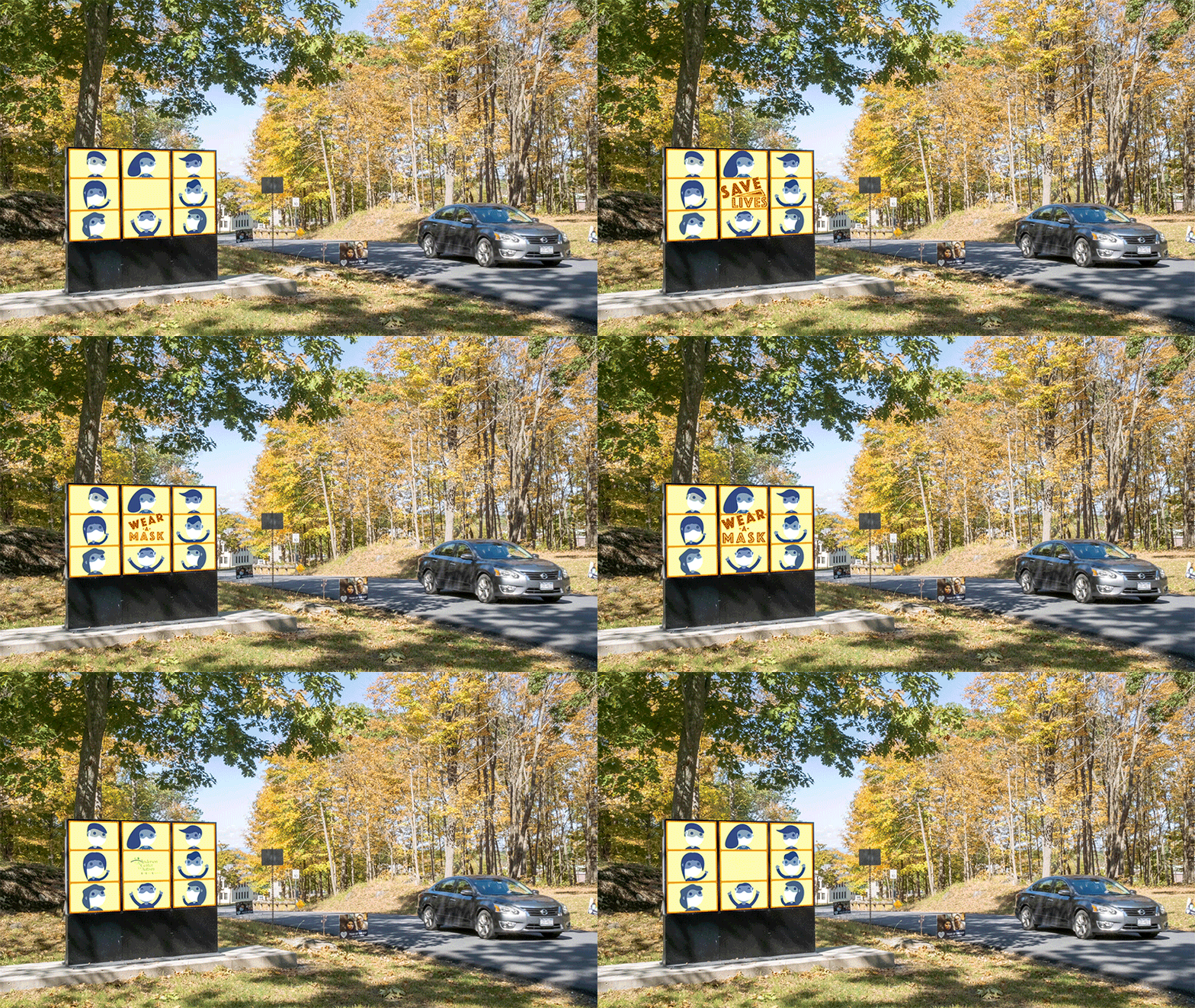
The entrance display consists of three separate vertical displays that do not sync up. The gaps between the displays are also a little larger than most. This breaks the illusion of the televisions being a singular display.
To give the sign an appearance of a single in-sync display, I chose to break the design up into nine quadrants. Each had a character displaying their own movement. The animations were designed so their reaction could be a valid interaction with another, no matter what part of the cycle each video was on.
An additional challenge occurred from crafting effective drive-by signage with the dialog staying at or below seven words. Seven words is considered to be the most words a designer should display on a road sign to be functionally digested by the driver.
Due to the gaps between the displays being relatively large and no sync is available, it was determined that the dialog needed to stay on one vertical pane and quadrant to ensure effectiveness.
The speed at which cars are able to visibly see this sign and pass was calculated to be around twelve to sixteen seconds. This timing allows for the video to have text which cycles and avoids the driver missing any of the dialog presented.
The standard television display was designed to serve as an extension of the outdoor one.
The overall theme of wearing a mask is front and center, but it includes additional information later in the video. This section could be quickly updated/modified if new pressing information became available.
Posted with permission from Anderson Center for Autism.
All Rights Reserved.

